Case Study

Polkadot

Visit Website

About

I built design infrastructure for Polkadot's global ecosystem, collaborating on a shared design system with product and engineering teams, then architecting event platforms that supported millions of users. I translated complex Layer-0 blockchain concepts into interfaces that drove measurable adoption across a decentralized community.

2022 — 2024

Impact

↳ Served ~6M visitors to polkadot ↳ 23% conversion rate on staking ↳ 1.7M+ event reach

My Role

↳ Web UI Designer ↳ Product Designer
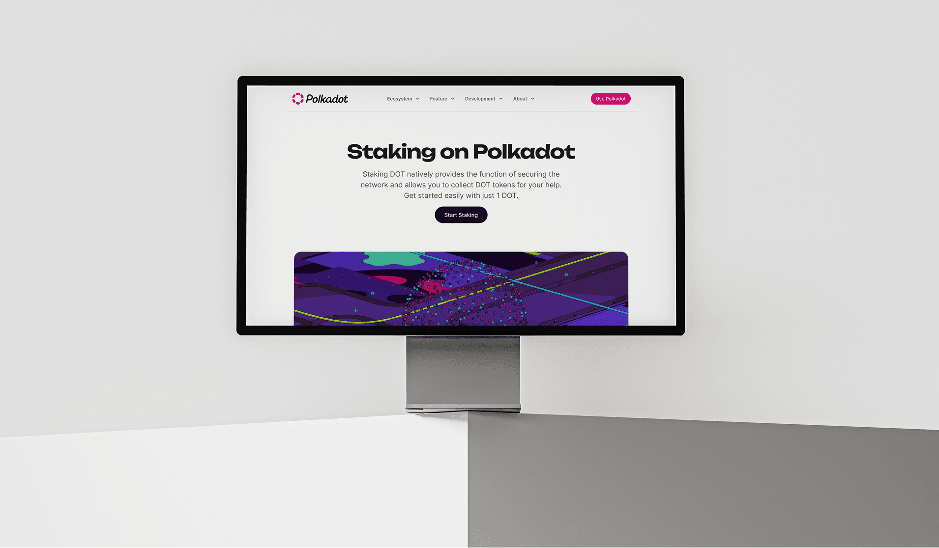
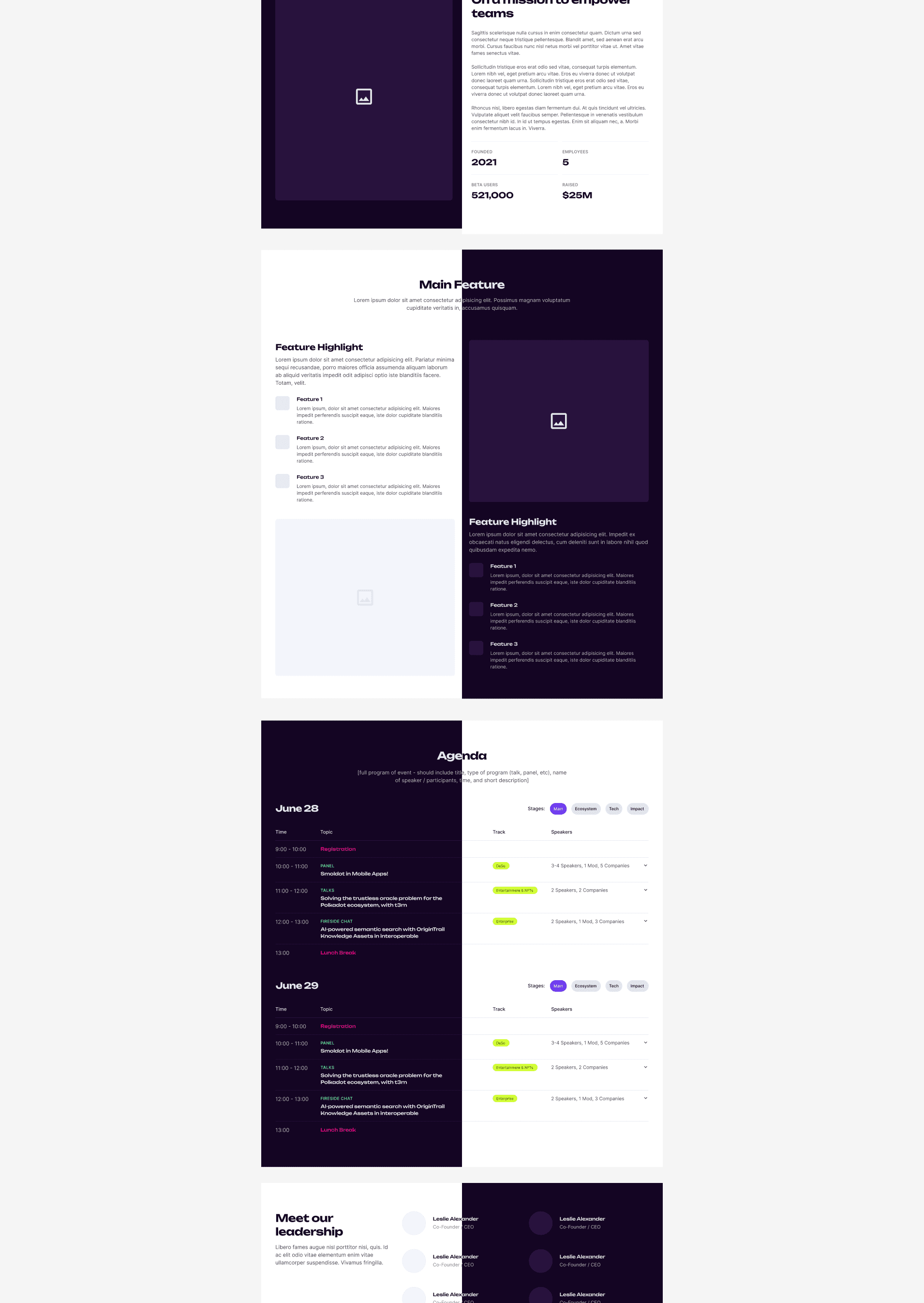
Staking on Polkadot

Hero section for the staking page. Achieved a 23% conversion rate on the "Start Staking" CTA.

A clean, modern website landing page design for Polkadot Staking displayed on a desktop monitor. The UI features a minimalist white background, bold sans-serif typography, a dark "Start Staking" call-to-action button, and a vibrant, geometric abstract illustration in the hero section.

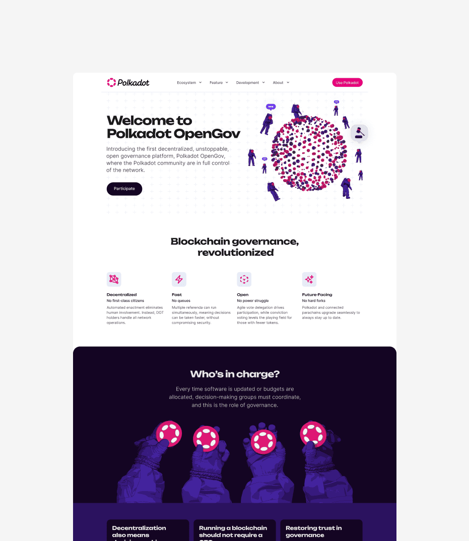
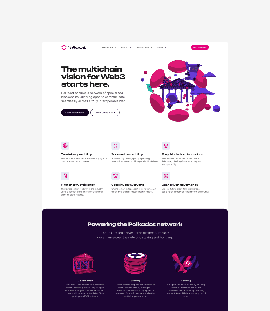
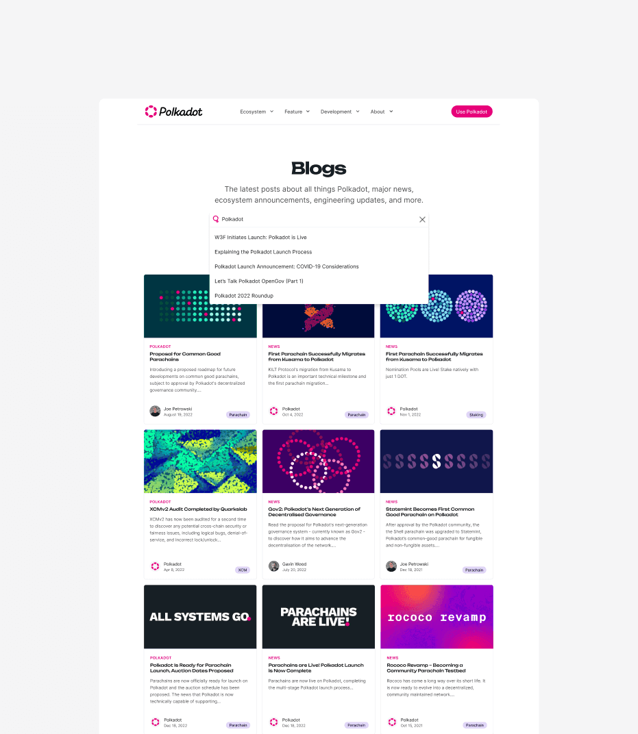
Notable page designs

Led design across the Polkadot website, including OpenGov, Home, Cross-Chain Messaging (XCM), and blog pages.
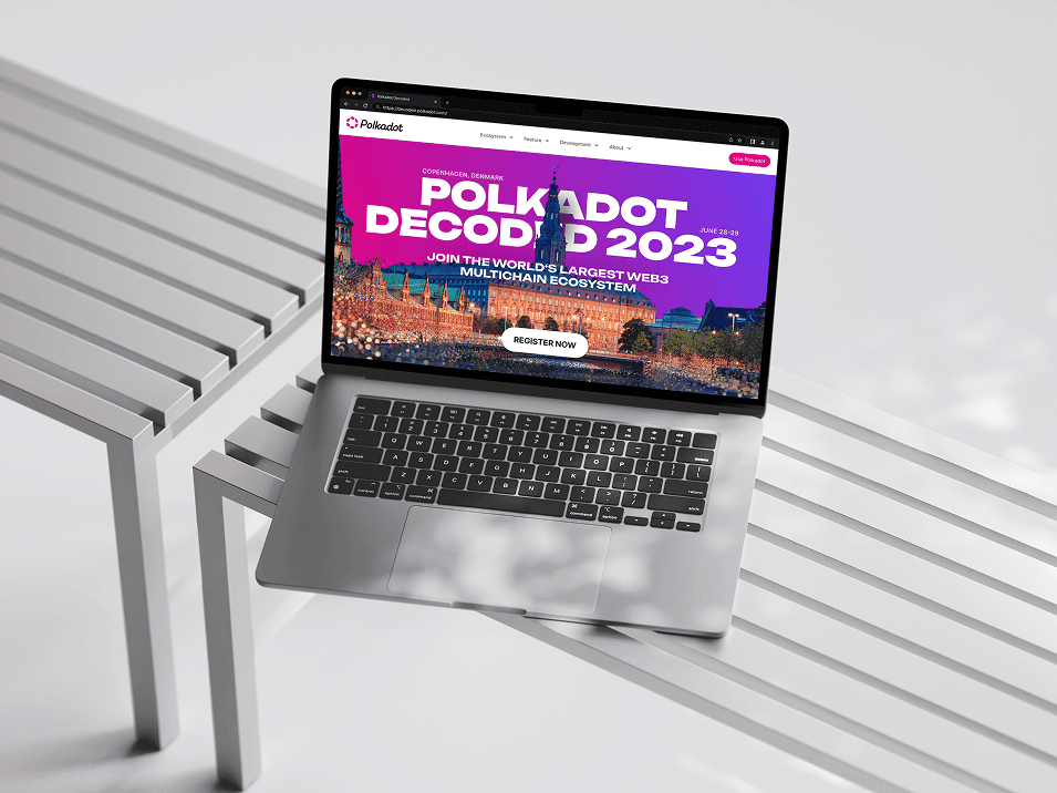
A comprehensive web page design for Polkadot OpenGov showcasing a decentralized governance interface. The layout includes a four-column grid of icons explaining network features, a dark-themed "Who’s in charge?" section with custom illustrations of hands holding tokens, and a professional pink-and-purple color palette.
Web design layout for Polkadot's Multichain Vision for Web3. The page features a dynamic 3D abstract graphic, a feature grid highlighting interoperability and scalability, and a dark footer section explaining the utility of the DOT token for governance, staking, and bonding with custom pink icons.
A functional blog archive page design for Polkadot featuring a grid of content cards with colorful thumbnail art. The UI includes an active search dropdown overlay and metadata tags like "Parachain" and "Governance," demonstrating a clean, user-friendly information architecture and typographic hierarchy.

Polkadot Decoded

Hero section for Polkadot's flagship conference, hosted in Denmark, 2023.
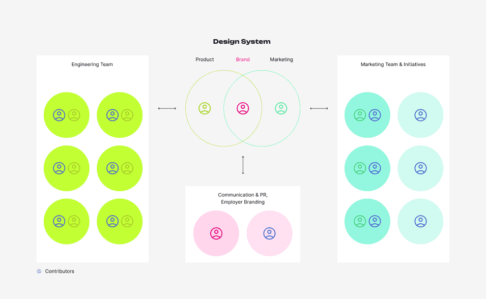
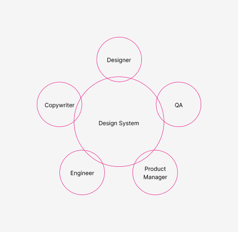
A high-fidelity MacBook Pro mockup featuring the Polkadot Decoded 2023 event landing page. The UI displays a vibrant purple-to-pink gradient hero section with architectural photography of Copenhagen, bold white event typography, and a prominent "Register Now" call-to-action button.

Design Ops

Mapped out department roles and defined how the brand and product teams work together.

A typography style guide showcasing the font hierarchy for a design system. It features a scale of headings from H1 to H6 using the "Unbounded" font and body text styles using "Inter," with a detailed table outlining pixel sizes, weights, and letter spacing.
A technical branding diagram showing the horizontal Polkadot logo construction. The image illustrates the precise spacing and alignment rules using "P" unit guides to define the clear space around the pink circle-pendant icon and the black "Polkadot" wordmark.
A brand identity style guide image showing the vertical (stacked) version of the Polkadot logo. The diagram uses grid lines and "P" unit measurements to ensure consistent proportions between the iconic pink logo mark and the centered typography below it.

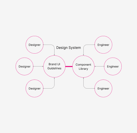
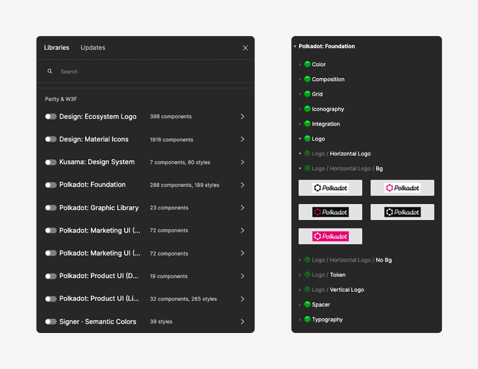
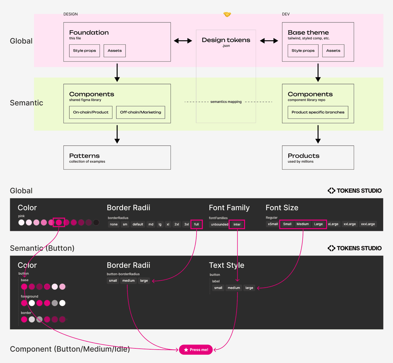
UI Component Library

Built and maintained shared libraries for marketing and product. Designed for full light/dark mode. Used Token Studio to manage semantic tokens and streamline engineering handoff before Figma Variables existed.

A full-page web design layout for a tech event featuring a "Hero Section" placeholder, a partner logo cloud with brands like Kusama and Ethereum, a data-driven "Trusted by developers" section, and a detailed event agenda table followed by a comprehensive multi-column site footer.
A clean, modern website landing page design for Polkadot Staking displayed on a desktop monitor. The UI features a minimalist white background, bold sans-serif typography, a dark "Start Staking" call-to-action button, and a vibrant, geometric abstract illustration in the hero section.

Polkadot Logo Clearance

Logo clearance guidelines to keep brand usage consistent.

A technical branding diagram showing the horizontal Polkadot logo construction. The image illustrates the precise spacing and alignment rules using "P" unit guides to define the clear space around the pink circle-pendant icon and the black "Polkadot" wordmark.
A brand identity style guide image showing the vertical (stacked) version of the Polkadot logo. The diagram uses grid lines and "P" unit measurements to ensure consistent proportions between the iconic pink logo mark and the centered typography below it.

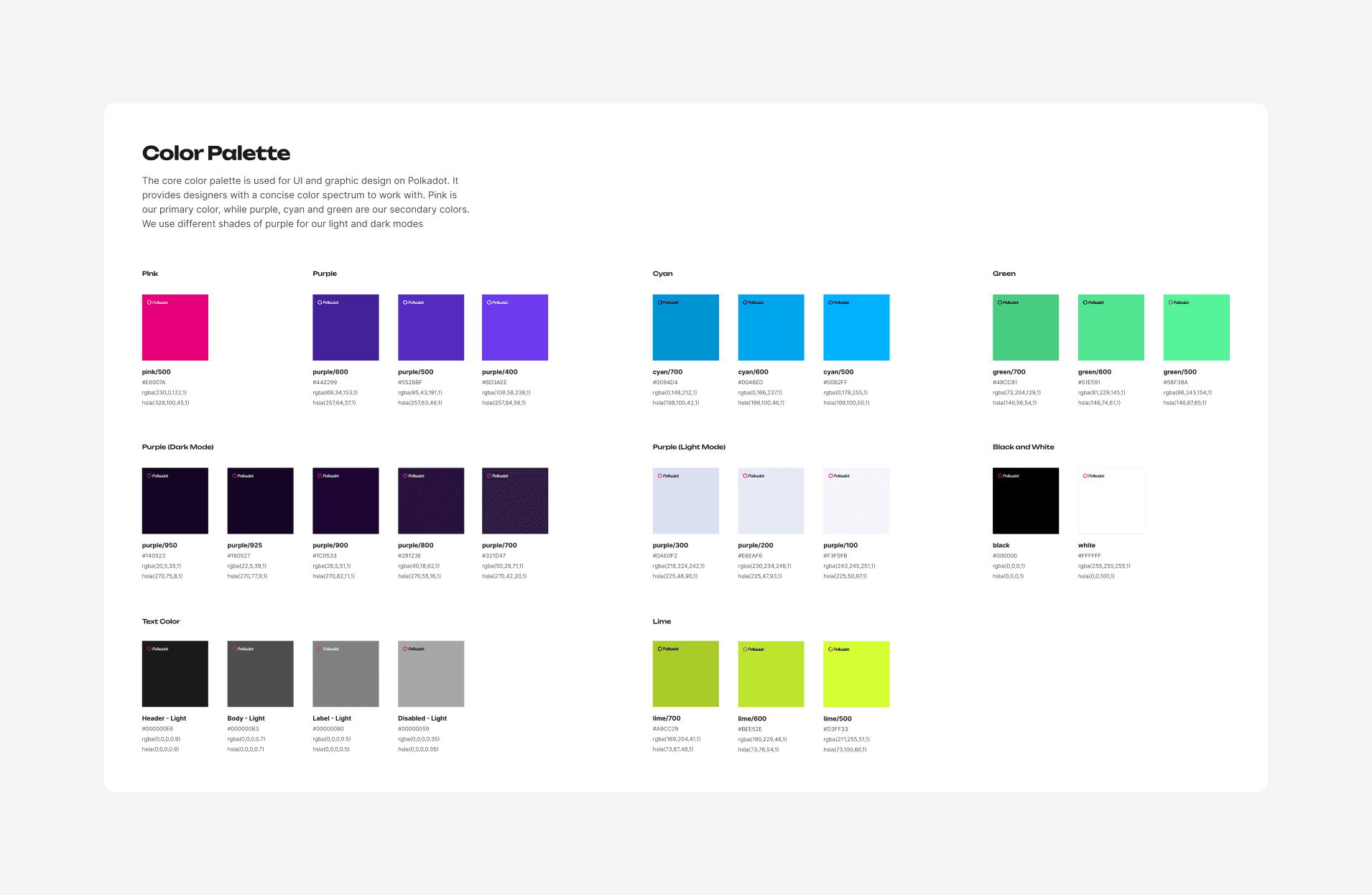
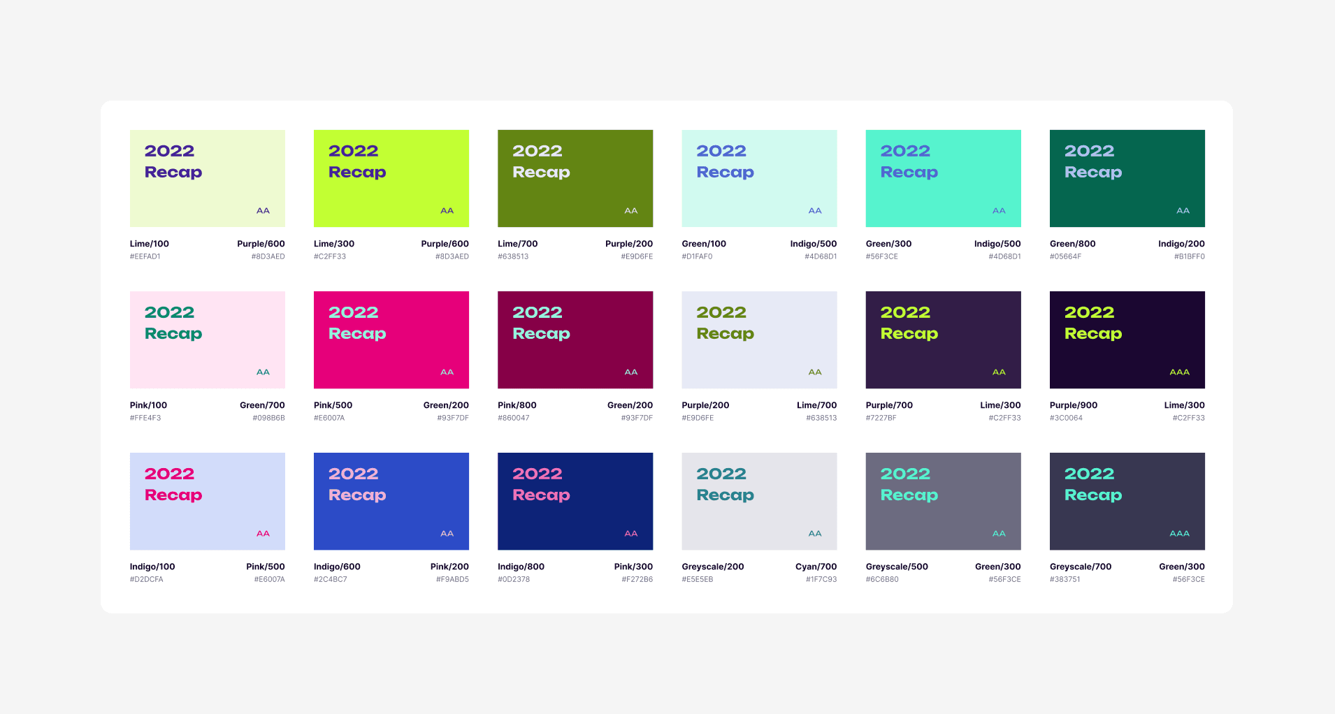
Polkadot Color Systems

Color system for brand and product. Covers graphic asset creation, UI theming, and consistent color combinations across all materials.

A full-page web design layout for a tech event featuring a "Hero Section" placeholder, a partner logo cloud with brands like Kusama and Ethereum, a data-driven "Trusted by developers" section, and a detailed event agenda table followed by a comprehensive multi-column site footer.

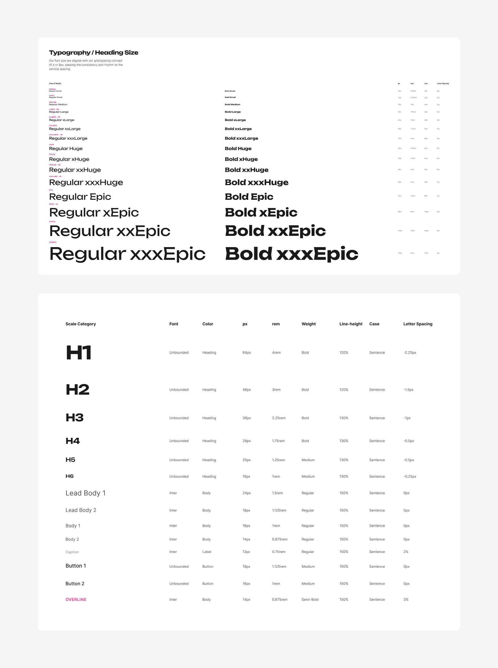
Polkadot Typography Systems

Typography system for brand and product, with semantic definitions for desktop/web usage.

A typography style guide showcasing the font hierarchy for a design system. It features a scale of headings from H1 to H6 using the "Unbounded" font and body text styles using "Inter," with a detailed table outlining pixel sizes, weights, and letter spacing.

Polkadot Thailand Meetup

Designed signage, backdrops, and wristbands for the local event. Spoke about design work culture with the Thai Polkadot community.

Process

At Parity Technologies, I worked within the MarComms team driving the Polkadot ecosystem's marketing efforts, collaborating with the Brand Lead to launch Polkadot's new identity. I integrated the "Unbounded" typography and iconography across high-visibility properties and contributed to the Brand team's initial design system to streamline global asset production. A key part of this involved partnering with a product designer and the engineering team to implement a robust design token system before Figma variables even existed. We built a foundation of light and dark UI components for web and product applications, enabling the team to visualize and prototype at extreme speeds. This was a deep dive into design operations, focusing on how to scale shared systems within high-velocity, cross-functional environments. I later transitioned to the Web team where I architected a scalable system for launching event landing pages, supporting global conferences like Polkadot Decoded, Devcon, and SXSW. Beyond my core responsibilities, I remained active in the decentralized community, designing event assets for official Polkadot meetups in Bangkok. This experience gave me a front-row seat to the technical challenges of managing brand and web systems across a global, decentralized organization.

Navigation